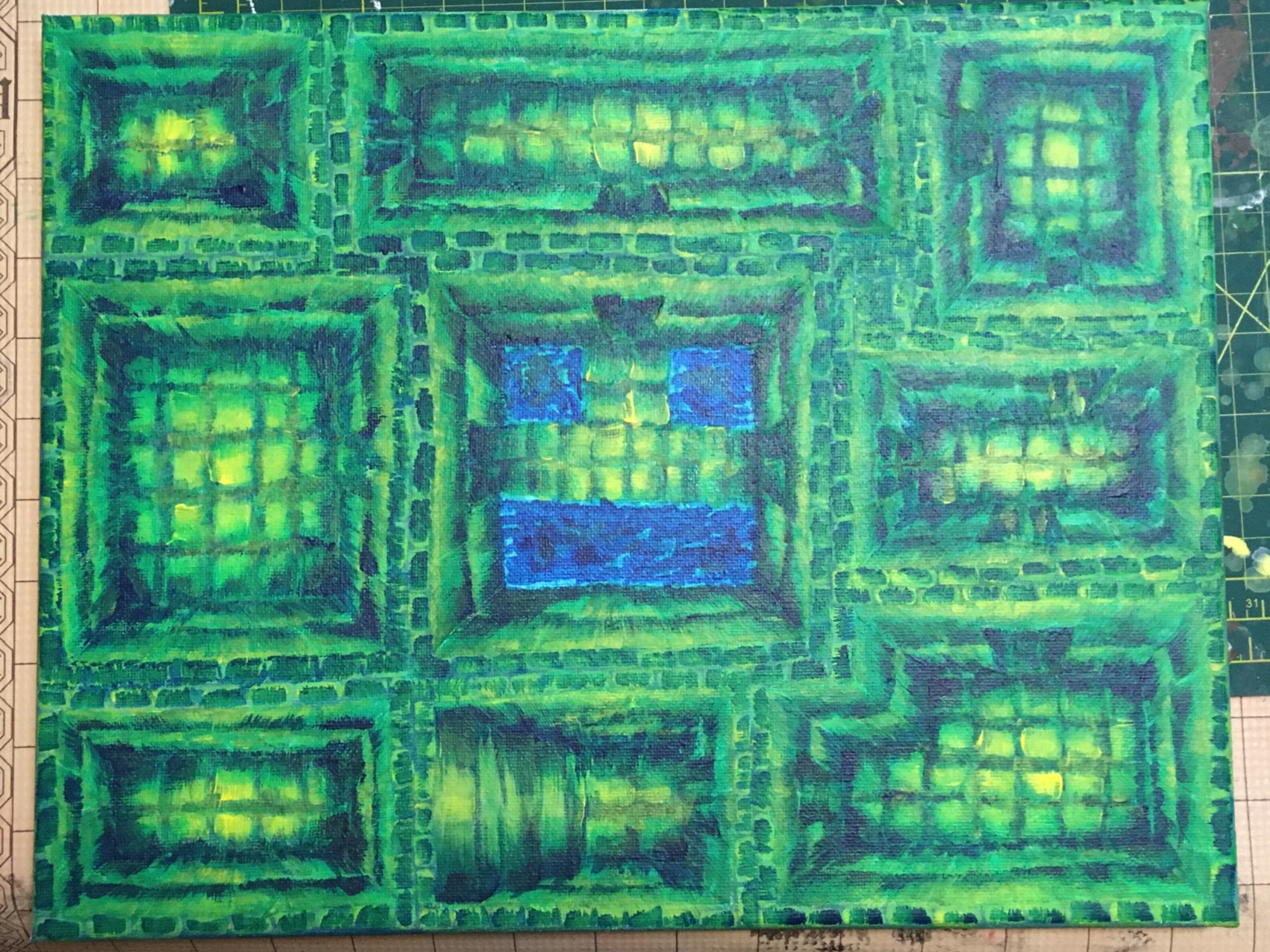
I wanted it to be a bit more green so I tried washing it with a watery green. I was hoping for something like a photoshop overlay, but I’m not using the world’s greatest paint, so I actually ended up running some paint off, exposing the canvas.
So, I had to get a bunch of stuff covered, so I went in with stronger highlights and a green mid-tone, which did make it a little greener. That’s probably what I should have rolled with from the start.
It’s not as green as I’d like, but I don’t trust myself to add more without destroying all the contrast and lighting. The lighting is strong but unartful in such a way that it now looks like the middle of the rooms are bulging up. I kind of like that, though, so I’ll leave it.